Tuesday, December 6, 2011

Project 2 part 1


When looking at this project, I realized quickly that I would be able to incorporate more from my inverse model of Fallingwater than from my model of the pattern into this redesign of the Linear Gallery, so I took most of my specific ideas from that. For example, I wanted to focus on layers of overlapping volums that interact with each other in very specific but different ways. So in my Linear Gallery model, I expanded the gallery vertically and towards the building's interior, establishing 4 different zones, some with visual connections, open air connections, similarities in rhythm and repetition, or simply circulation connections. 

I did want to include my pattern model into this design as well. I thought it would be out of context to include the forms themselves, but I am considering ways to incorporate the simple concept of moving in towards a center with the exterior enclosing in as seen in the patterns focus in on the circular form.  So I explored doing this in a potential film room where it takes on an amphitheater style that has a focus on one point.

Tuesday, November 29, 2011

logos


I began with a simplistic form trying to emphasize the shape of the L and creating a piece that hierarchically resembled a linear path. In the process, I added a gridded background to represent 2 parts of the mission statement: the works that would be presented in the gallery itself and the concept that the gallery is a backdrop for ideas. I progressively altered the backdrop concept in its color and form and I also chose to represent the linear element in various ways.

Later in my process, I wanted to added a more literal and 3-dimensional aspect to the logo. I began with a simplistic graphical concept of a perspective of the gallery's flooring, then moved into a more complete perspective that displays the walls and ceiling. Throughout the entire process, I tried incorporating different variations of negative and positive spaces created by the text.

Tuesday, November 22, 2011

Project 9


As with project 8, I wanted to 3 dimensionally model the individual forms from the 2 dimensional pattern. I derived the 3 dimensional objects from the lines and focus of the pattern itself. For example the green star pattern forms curving lines that intersect with each other along the way. They also create a circle pattern that narrows in on itself towards the center or expands outward depending on how you see it. These observations brought me to my last project. For the physical representation, I wanted to emphasize something that I see in the two dimensional pattern that I would be able to create in a physical model: motion.

As I view that pattern, I feel pulled into the image. I also see the star form moving along its curved linear path. My intent was to recreate this feeling, and to also make a more literal representation of the motion. I chose to use the extruded difference in circular forms to create a cone that would act as the base for supporting the rest of the model in motion. I wanted to allow for the curved lines to be able to actually spin as I see them in the 2D pattern.

Thursday, November 10, 2011

Advice on Changing Materiality

Hey gang, also for your knowledge, I discovered how to get rid of the annoying purple faces that appear when you use the subtraction tool. Double click on the paint tool and change the selection to clear all faces. Then when you use the paint tool to change the materiality, all of the faces will change! Hooray!


 I chose to include the plan and section of me 3D model of the pattern to better show how I interpreted hierarchy among the elements. I felt the star form and the circles should be on the same plane at each level because it is those star forms that actually create the circular image in the pattern itself. I stacked these layers to lead to a small sphere at the bottom because that's how I interpreted the way the pattern leads your eye when you view it.


 I primarily wanted to emphasize the circular form developed in the pattern by making it a solid green, secondly the object that formed the pattern itself by making it a more transparent green, and thirdly the curving form in the background by making it black, similar to how it stands in the pattern itself.


My 3D modeling of the photo of Fallingwater I took was a bit more literal.  I felt it was important to clearly model each of the primary planes, their materiality, their thickness, and their depth in the photo. Falingwater is all about overlapping volumes and I wanted to make sure that read in my model. I used the lighting to highlight the texture in the hybrid. In the artificial lighting one (image 3), I used a low cone light to place hierarchy on the stairs moving from the volume of the water to the room above.

Thursday, November 3, 2011

portfolio spreads


My goal was to create a clear consistent layout from spread to spread. I hoped to give each spread a bit of originality that would be unique to the project itself. I chose to focus on color scheme. I used a series of color blocks to highlight certain colors seen in the project's palette.

I also followed a grid pattern to establish clear datum lines along the pages and throughout the portfolio.  My layout is meant to begin playing with positive/negative space using overlap of colors, black space and white space.

Thursday, October 27, 2011

linear gallery bay


My intent for this project was to put a strong focus on materiality and lighting. When experiencing the space, I felt that it was especially intimate not only because of the scale but also because of the style of lighting and the surrounding enclosures. I composed the second drawing in this manner to articulate the variation in  privacy and scale from the linear gallery bay to the exterior courtyard. Both use enclosure to define boundaries, but the linear gallery is more concrete in these definitions...both literally and figuratively.

Tuesday, October 11, 2011

revision 1

For this iteration, I tried to make the progression of my project a bit more clear. I hoped to make each step lead to the next. So the in the background, the basic original pattern is visible. This is meant to show where I began. From here downward, that form becomes a series of 3-dimensional extruded form that establish the same pattern. From this pattern, I extruded particular pieces of the form to show which areas I focused on in my analysis. I wanted to emphasize the distinct geometry that could be created using the 3D form of the pattern I began with. I hoped to show how each step of adding or subtracting pieces was able to create a new geometric space.

I also wanted to highlight the most prominent form, the octagon, by stacking the pieces on top of one another to create that shape using a hierarchical white wireframe rendering. Then to transition into the most prominent idea, I used rotation of wireframe to break the form down into it's simplest elements before building it up into the generalized spherical shape in the top left corner.
As far as general editing of rendering techniques from the last rendition to this one, I chose to focus on more consideration for light and contrast.

Tuesday, October 4, 2011

Project 5


For this assignment, I expanded on my pattern and 3 dimensional interpretation from the previous week. I focused more on establishing clear geometry from the characters themselves as well as the spaces in between. I began by layering the 3d object in an axon to see how each element added on top creates a richer more complex geometry.  I highlighted the spaces in between using color and 3d extrusion.  I also focused on the spherical form that the pattern had the potential create through rotation. I used this as an opportunity to establish a greater sense of life and movement on the page. I wanted to capture the graphical transformation and rotation of the octagonal shape.

The 3 dimensional images are in the foreground while more 2d analytical images are int eh background. I included my original pattern, aligning it on a grid to identify its structure. I also wanted to emphasize my original finding of the nature of the character's sizing my reinforcing the thickness using a dashed line. Above, I included a wireframe axon of the 3 dimensional pattern to transition from the rendered form and establish a more clear understanding of the overlapping spaces.

Tuesday, September 27, 2011

3d pattern

After having the last pinup, I realized my pattern was more complex than necessary, and would be difficult to model legibly in 3D, so I went back to try to simplify my pattern. This time, I focused more on creating forms from the negative space than stacking and overlapping forms. This image is the new pattern I developed.


With this pattern, I used a series of rotations and reflections to establish a noticeable star configuration in the negative space. From here, I chose to emphasize this space in Form Z.  I wanted to highlight this form by raising it above the level of the rest of the pattern. I also tried to develop hierarchy among these figures with the use of additive versus subtractive techniques. I reinforced this concept with some color and transparency in surface styles.  I wanted the star extrusions to be transparent so that the original pattern could still be read.


Tuesday, September 20, 2011

patterns

I ended with a series of three layers of the same pattern.  Each layer is twice the size of the one underneath. This is meant to emphasize the relationship between the stem thicknesses of this typeface.  I chose to create a pattern that was dynamic, incorporating both straight lines, clear diagonals, as well as curves that all interact. The bar of the blown up bold pattern in the center is intended to attract viewers to see more clearly the finite details of the pattern connections.


In this board, I wanted to contrast the horizontality of the previous board. I realized that my analysis was more about the vertical alignment of the characters. I hoped to establish the concept that two of one element fit into the next. The vertical bars are identifying the width of the characters in each layer of the pattern.

process


The goal of my pattern was to establish the spacial interaction between 3 main characters of the typeface I studied earlier. The N, U, and V are all representative of many of the general characteristics that define this typeface. In my analysis, I had already found that both the U and N were the same width along with several other characters.  I had also noticed that this typeface featured a style where 2 primary line thicknesses were used to create charters. After further analysis, I found that the thicker line weight was exactly twice the width of the thinner one.  I wanted to highlight those proportions in my pattern. After rearranging and transforming the characters I developed this pattern where the two thin portion of the V and N line up to establish the thickness of the U, while the other half of the U continues to line up evenly with the other stem of the N. I tried to highlight/bold certain characters to make them identifiable.


From there, I began playing with the idea of separating the pattern, but I realized this took away from my initial intent of identifying the spacial analysis.


I went back to my original pattern, choosing to highlight characters in a series of rows. I also added a dividing element to make the division more clear.  The diving line was a series of I's. I used this opportunity to add another level of analysis to my pattern. This analysis covers the regularity of the shape of the serifs of this typeface.  The serif on the end has a curve that is derived from the same surve on the serif of the I, meaning the two can interlock perfectly.

Tuesday, September 13, 2011

Project 2


The goal of this design was to emphasize the difference in form of the two fonts despite their similarities. Both are serif fonts that include only capital letters. The University font is a much more elongated, elegant font with curved forms and thin linear elements. On the other hand, the Grand Central font is shorter in stature with thick, broad elements, a blocky form, and wider spacing. I chose to use both pages of this project to reinforce each other.  I began by choosing to represent the University font with predominantly white lettering and the Grand font with black lettering so as to emphasize their contrasting thickness. I positioned the primary lettering of the full words in such a way that highlights an animation of their form.  For example, I wanted to show the short stature of Grand by having it appear to be pushed down on by the graphics above while University is raised above with more freedom to extend upwards. These two actions are created by the integration of both fonts’ T characters. The difference in these characters is clear: the top T has curvature where the bottom T has sharp, clear angles.  In order to continue to bring together the two boards, I established a blend of both fonts’ N characters to show a clear transition.  In addition, I used a gradient of grayscale to provide a clear flow from one page to the other as well as to alternate positive and negative tones. 
The individual design of the University page is intended mostly to highlight thinness and curvature. The various characters in the background are arranged so that their curved paths align and that their similarly curved serifs conjoin. I chose to gradually reduce the size and stroke of the characters as they appear to go back in the distance of the page so as to reinforce the concept of the thin nature. Another primary feature of this board is the blown up U character that frames the page in order to bring attention to the way this font has a tendency to have a greater width on the left side then transitions to a sleek smaller width on the right.
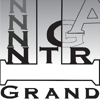
            The individual design of the Grand Central page is intended to highlight thick, bold width as well as block-like features.  The added characters to this page are stacked to emphasize the sharp angles. I also chose to animate the actual word usage on this page by centering the word ‘central’. To provide more emphasis on the edges of the font, I again used stacking, this time on top of the larger scale serifs of the T. In contrast with the first page, the stroke and scale of the additional characters increase as they are intended to pop out of page to establish the bold features of the font.